Background
As a product designer, I've always been passionate about shaping user experiences. While product design offers immense satisfaction, I recently found myself drawn to the dynamic world of web and landing page design. Inspired by the stunning hero sections I've seen from talented designers on X, I decided to dive deeper.
To challenge myself, I leveraged the power of AI — specifically Gemini — to act as my client and generate a realistic website brief. This portfolio piece showcases the result of that exciting exploration.
Project Brief
Brand Name: GreenThumb Grocers
Description: GreenThumb Grocers is a local, family-owned grocery store committed to providing fresh, high-quality produce and locally sourced goods to the community. We believe in supporting local farmers and offering a friendly, personalized shopping experience.
Color Preferences: We want to evoke a sense of freshness, nature, and trustworthiness. Think earthy tones like warm greens (#557153), natural browns (#A0785A), and perhaps a touch of a vibrant accent color like a sunny yellow (#FFD700) or a cheerful orange (#FF8C00) to highlight special offers or calls to action. We want it to feel inviting and wholesome.
Brief for the Use Case:
We need a simple yet effective landing page to promote our new online ordering and delivery service. Our goal is to make it easy for existing and potential customers to learn about this new offering and start using it.
Here's what we envision for the user experience:
Clear Announcement: The first thing visitors see should clearly communicate the launch of our online ordering and delivery service. A prominent banner or headline is essential.
Highlighting Benefits: Quickly convey the advantages of using our online service – convenience, fresh produce delivered to their door, supporting local, etc. Use concise bullet points or short paragraphs.
Easy Navigation: Provide clear and direct pathways for users to start browsing products or learn more about the service. Obvious calls to action like "Order Now" or "Learn More" are crucial.
Simple Explanation of the Process: Briefly outline how the online ordering and delivery works (e.g., browse, add to cart, checkout, delivery).
Call to Action for Sign-Up/First Order: Encourage users to take the next step, whether it's creating an account or placing their first order, with a clear and compelling call to action. Consider offering a small incentive for first-time users.
Contact Information: Provide easy access to our store's contact information (phone number, email) for any questions or assistance.
Mobile Responsiveness: The landing page must be fully responsive and easy to use on smartphones and tablets, as many customers will likely access it on the go.
Sense of Local Community: While it's an online service, we want to maintain the feeling of being a local, community-focused business. Consider incorporating subtle design elements or wording that reinforces this.
Essentially, we need a landing page that is straightforward, informative, and encourages customers to try our new online ordering and delivery service. We want it to be easy to understand and visually appealing, reflecting the quality and freshness of our products.
Solutions
With the project brief, I compile all requirements and create this wireframe.
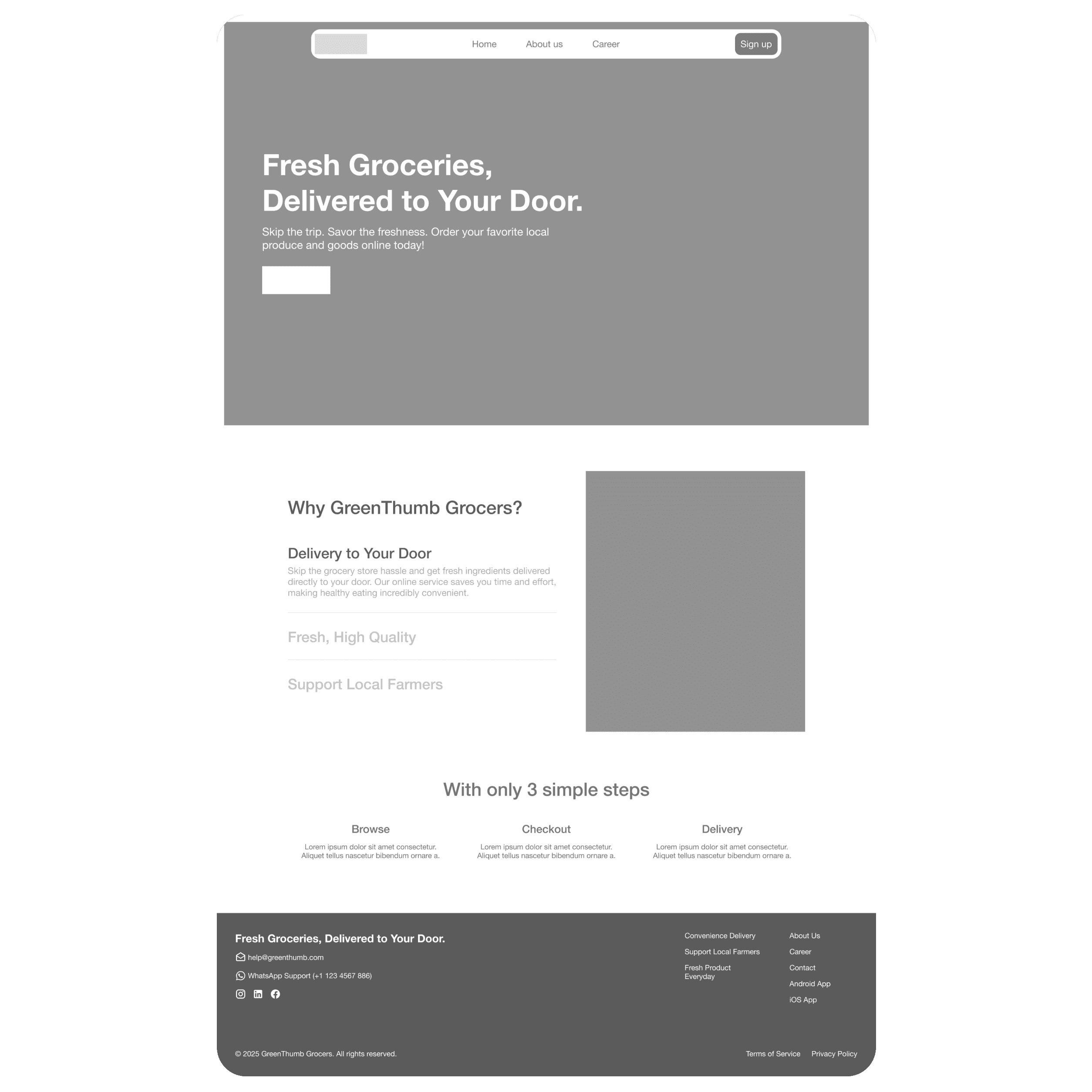
My primary goal for this wireframe was to maximize the information users could grasp at a glance, ensuring a clear and immediate understanding of GreenThumb's value. I started with a compelling hero headline: "Fresh Groceries, Delivered to Your Door." This instantly communicates the core promise: fresh products, conveniently brought to their home. An immediate Call-to-Action (CTA) then guides users directly into the shopping experience.
Following the hero, I strategically highlighted GreenThumb's Unique Selling Propositions (USPs). These articulate what sets GreenThumb apart, symbolizing convenience, fast and high-quality products, and a commitment to community care.
The next section simplifies the user journey, breaking down the shopping process into three effortless steps: Browse, Checkout, and Delivery. This guide assures users how easily they can receive fresh groceries right at their home.
Finally, a comprehensive footer provides essential supplementary information, including contact details, social media links, and additional navigation.
Final Result
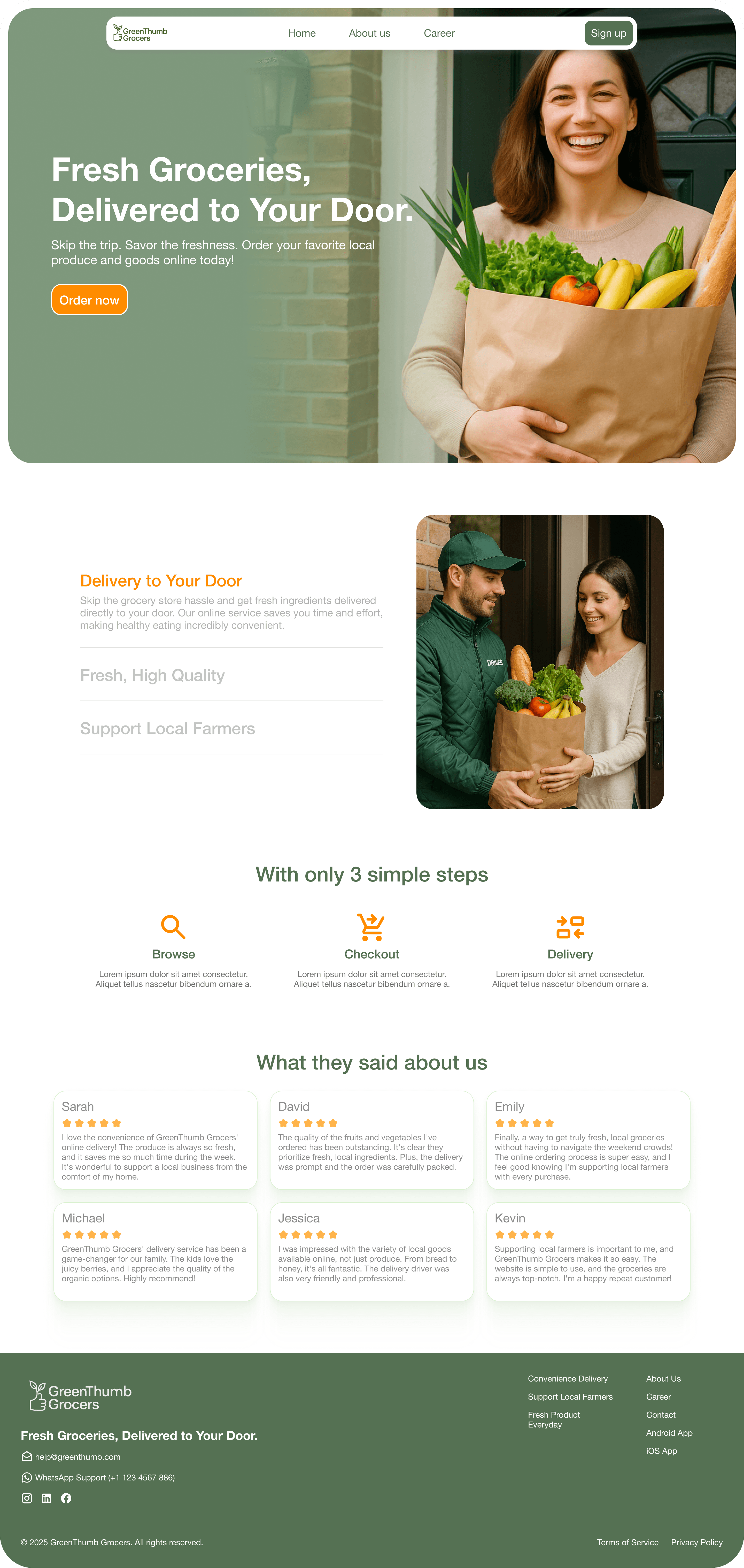
I translated the approved wireframes into high-fidelity designs with a focus on emotional connection and conversion. For the Hero Section, I utilized Gemini to generate imagery featuring a smiling customer, immediately highlighting the satisfaction associated with GreenThumb Grocers.
To establish a cohesive narrative, I maintained this visual style into the USP Section. This visual continuity creates a relatable story, encouraging potential users to envision themselves using the service.
For the User Journey, I introduced intuitive icons. These serve as visual cues that reduce cognitive load, allowing users to instantly grasp how the service works without heavy reading. Finally, I integrated a Review Section to leverage social proof. This builds necessary trust, positioning GreenThumb Grocers not just as a store, but as a reliable partner for daily needs.
Goal: The primary objective of this landing page redesign is to drive conversion by establishing trust and relatability.